Sunday, August 10, 2014

Website - The Potter's Hand

I have never tried to design a website before, other than in a drag and drop site like Weebly or Google sites. I have been working on my pottery skills over the past two years after quite a long hiatus after high school. I wanted to create a page to celebrate the work that I've done and to create a portfolio of that work. While I am far from a professional, I am proud of the pieces I've made and have seen significant improvement over time. This project was quite time consuming, especially photographing, loading, and editing all of the individual images of each piece of pottery. I am not thrilled with the final product, but I do think it's a strong stab at and initial design. I'd love to hear feedback!


This is the new iteration of my website. I moved the logo out of the navigation bar, altered the fill and text colors, and changed the opacity, filter, and background image of the photo behind the thumbnails. Is this less distracting to the eye?

Wednesday, June 25, 2014

Avatar


 This is a shot of my friend, Lindsay, in her mother nature Halloween costume from several years ago when we were much younger and cooler. I thought it would make a great base for a fantasy avatar design because it already seems somewhat otherworldly. I wanted to use an entire human figure, rather than just the face. 

I followed the Avatar Na'vi - Photoshop CS6 Tutorial, learning new tricks, like adding a masking layer, a skin texture layer, and "dodging and burning." I enlarged her eyes, appreciating the “feather” effect, added a darker outline, and painted in vivid irises. I used the "liquefy" feature to elongate her finger and toenails, and to bulge her nose and lips. I painted her hair purple and her skin with a yellow tone. I played with the hue/saturation effects, added a translucent butterfly mask over her face. I added a firefly photo to create additional lighting effects. I then made a brush from the butterfly photo and used it to add to the background and to color her skin with an orange hue. I also put a “Poster edges” filter over the entire composition. I am concerned that the final product is not that different from the original photo and that the original was so cool to begin with, that I can’t really take any credit for the alterations.


This is a photograph of my 8 year old niece, Isabella. I followed the tutorial to yield this rendition of the avatar. In the final draft I added a background of the "soul tree" from the film. The process ages her in a disconcerting way. I'm not sure if I like it!
Retrieved from http://chrismason90.blogspot.com/2011/11/theory-suspension-of-disbelief.html

Monday, June 16, 2014

Book Cover - Pete Seeger


I wanted to create a book cover celebrating Pete Seeger because he was an influence on my early years and as it would be timely, due to his death a few months ago. My mother used to sing "Where Have All the Flowers Gone" to my siblings and me when we were little.  My parents took me to one of his concerts when I was little and I also saw him perform at the Clearwater Festival when I was in college. What resonates with me most about Pete Seeger is that though the specific details of the strife faced by multitudes throughout the world vary, his message for peace, which is direct and almost naïve in its simplicity, resonates universally. I wanted to create a book cover that references Seeger's If I Had a Hammer as well as his heart wrenching Where Have All the Flowers Gone. I thought the title Gone to Flowers would work well as it also suggests his own passing as well as the theme of rebirth in the natural cycle of life. In the planning stages, I also thought about creating a cover for my colleague and friend, Gian Tornatore, a jazz musician, but I abandoned that idea for Seeger. In the making of the cover, I applied some new skills I've acquired over the past few weeks. I used the "clone stamp" extensively, merged layers, used the selection tools more effectively along with the fill, played with opacity, added filters, and downloaded a typewriter font to give the book cover a more dated feeling. I even created a new brush in the shape   of a bell, as one iteration of my design had the silhouette of a tree with bells for leaves. I feel as though I have looked at my design for too long to have an objective opinion, but I think it carries the feel of Seeger's folk artsy vibe. It incorporates symbols of his music and celebrates the music of a man who had a profound impact on humanity.


Works Cited
"A Beautiful Oak Tree in a Rural Setting at Valley Field Road.......523."Panoramio. N.p., n.d. Web. 
            14 June 2014.

Davidson, Bruce. Pete Seeger plays his banjo in Beacon, New
York. 1965. "Black and White Photos of Pete Seeger, 1919-2014." The New Yorker. The New 
Yorker, n.d. Web. 14 June 2014

"Curved Claw Hammer." Sears. N.p., n.d. Web. 14 June 2014.

"Landscape-Photo.net." Various Flowers. N.p., n.d. Web. 14 June 2014.

"Religious Big Bell." Dreamstime. N.p., n.d. Web. 14 June 2014.

"Six New Martin Guitars For 2011 - American Songwriter." American Songwriter. N.p., n.d. Web. 14 June 2014.


Thursday, June 5, 2014

Awareness Poster - Standardized Testing & Educational Reform

Here are my original sketches. I thought about posing my 2 year old son in my classroom, holding a number 2 pencil and filling in a bubble sheet, with a window showing a deserted playground in the background. The phrase "Value Added" refers to the algorithm that compares a student's scores from one year to the next and which have proved to be faulty.

In another concept, I wanted to address the loss of art music, and gym in our public schools. In this design an adult authority figure hands a pencil and test form to a small child who is standing in front of a trashcan overflowing with instruments, sports equipment, and art supplies. The caption would have read something like, "Put away your toys; it's time to learn." 

I am also interested in access to clean drinking water. One of my designs shows a fancy faucet dripping into the jerry can of a woman who has to walk miles to get water for her family. This design felt inauthentic because it is not my reality, but simply my idea of what someone else's reality might be, so I abandoned it. 

As a NewYork City public school teacher with a decade of experience, I've seen a slew of educational reforms come and go. Regardless of perceived merits of each new brilliant idea, what is readily apparent is that each wave of reform results in more standardized tests for our students. My poster addresses the newest of trends, the Common Core, which is an attempt to create national standards that promote critical thinking skills and increased sophistication of thought. While this sounds wonderful, the only part of the adjustment that has come to fruition is the writing of the standards and a new series of tests to measure student performance and therefore teacher performance. Kids now take tests in all subjects at the beginning and end of the year. I believe our middle school students spent 13 of their school days testing. As the parent of a small child. I balk at the thought of the amount of anxiety such a schedule creates. In addition, raising standards does nothing for students if support is not put in place to help them reach those standards. We could say that all of our students will gain acceptance to Harvard, but simply setting the standard will do nothing if the bulk of our students still read and write below grade level. To that end, more time spent testing and more teacher time spent grading these assessments hurts the very instructional trajectory these reforms seek to perfect. Anyway, my poster shows an adult hand placing a rotten apple core in the upturned hand of a trusting child. The image is set against a green chalkboard background. I merged a photograph of my own handwriting on my chalkboard into the photo and then slid a layer of a multiple choice bubble sheet across it to show my concern about the testing component. The core is rotten to suggest the issues with the movement. I have two versions here; the first is with the apple core pasted in its original configuration, but I was concerned about the consistency of the lighting. The second shows it flipped horizontally in an effort to make the lighting work.


This is my revised version, incorporating Pamela's feedback. I used the stamp tool to hid the swoosh of chalk in the lower left hand corner and angled the bubble sheet. What do you think?

And... my final draft with the slightly smaller apple, moved top hand, and call to action. 
Boycott standardized tests!

Works Cited


"Apple-core after Nine Days." Apple-core after Nine Days. N.p., n.d. Web. 05 June 2014.
"Chalkboard and Apple." HRVoiceorg RSS. N.p., n.d. Web. 05 June 2014.
"Hot Tub Blog." Hot Tub Blog. N.p., n.d. Web. 05 June 2014.
Trudon, Taylor. "Eighth Grader Designs Standardized Test That Slams Standardized Tests." The Huffington Post. TheHuffingtonPost.com, 17 Apr. 2013. Web. 05 June 2014.

Wednesday, May 28, 2014

Grotto - Album Cover

I played around with the idea of using the pyramids at Giza and a phoenix, but the design felt a bit too much like Katy Perry's Dark Horse video.

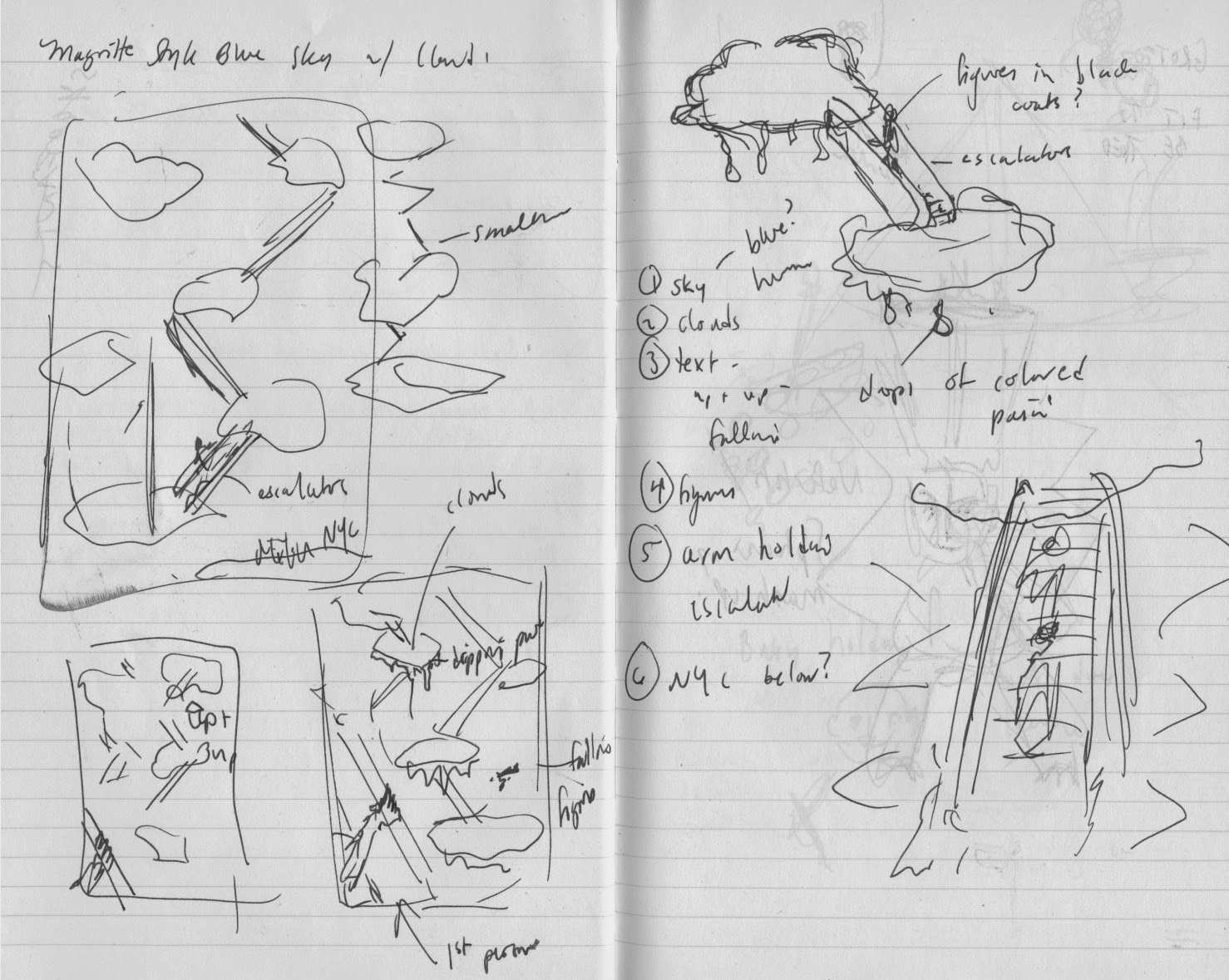
I liked the idea of contrasting manmade objects with the natural world. One of my album concepts was to put a series of escalators between clouds. I still like the idea, but didn't bring it through fruition.


I also thought about putting merry-go-round/circus tent/tops in orbit around the sun. Who wouldn't want to be a groupie for this band?

I struggled to think of 6+ images in one, but worked with the grotto concept until I felt it worked without feeling forced. 


Grotto - disturbance
I decided to design an album cover for a heavy metal band. Using more than six images requires filling the space and avoiding minimalism, so I felt as though the hyperbole of the design approach would most appropriately mirror the music of a band that is over-the-top itself - think jarring guitar riffs and big hair. I named the band grotto because of the hard consonant sounds of the guttural "g" and the double "t." I imagined my clients to be interested in promoting their fierce masculinity, so I used a roaring bear image with a gaping mouth. I set the image slightly to the right and raised so that the fangs, which I wanted to feature prominently, would fall according to the rule of thirds. I superimposed human eyes over the bear's sockets to create a discordant and disarming effect. It feels as though the bear is locking eyes with the viewer and challenging him/her. I created the illusion of depth by sliding a subway tunnel, shot in 1 pt. perspective,  into the bear's mouth. I liked the idea of creating light where the viewer anticipates shadow. To emphasize struggle and individuality, as well as to play with scale and contrast in shape and space, I merged a rock climber's silhouette along the bear's fang. The lower portion of the bear's mouth is fused with a photograph of rapids, more in scale with the rock climber and creating a natural landscape juxtaposed with the manmade subway tunnel. I wanted to add a unifying feeling to the piece, so I added a layer of an outer space background and added an ocean ripple effect. I also wrote the name of the band vertically along the left margin, using the eye-drop tool to match its hue to that of the fangs. I have never used photoshop before, so this project took me an inordinate amount of time. I loved discovering the background eraser tool and manipulating the opacity of the images. The online tutorials, while informative, are hard for me to watch, so I learned more from the process of creating the cover.  

There are some visible issues with the album cover. There is still a white line around the periphery of the silhouette. The edges of the human iris' should blend in better with the bear's face. I also lifted all of these images off the internet, so the piece doesn't feel as original as I'd like. I can't find the url for the waterfall picture. I foolishly didn't record them as I worked, so I had to look them all up again later.


Original Draft
In my new draft of the project, I started over and recomposed my image from the bottom up. I switched out the eyes and waterfall for different photos and I downloaded a new edgier looking font to fit with the heavy metal vibe. I played with the scale of the climber a bit and used some of the techniques suggested by the professor to select and incorporate images to try to increase the harmony of the overall image. I tried to select higher resolution photos, but I do like the slightly blurred effect of the bear's fur. Overall, I am less in love with my concept, but more skilled with some of the photoshop tools. I completed the second draft in about half the time of the first.
Revised Project

Works Cited
"A Silent Space." Serendip Studio. N.p., n.d. Web. 05 June 2014.
"Animals and Birds Pictures." » Brown Bear Open His Mouth. N.p., n.d. Web. 28 May 2014."Atlantic Avenue Subway Tunnel." , Brooklyn, New York. N.p., n.d. Web. 28 May 2014.
"Outer-space-stars." Left off the Tracks. N.p., n.d. Web. 28 May 2014.
Presse, Agence France. "Climber Dies Falling From Britain's Largest Mountain." Business Insider. Business Insider, Inc, 27 Jan. 2013. Web. 28 May 2014.
"River Rapids." - 1024 X 768. N.p., n.d. Web. 05 June 2014.

www.deviantart.com